In the fast-paced world of business, data is the lifeblood that keeps the machine running smoothly—or exposes the cracks when it doesn’t.
You’ve probably heard this before: “If you can’t measure it, you can’t manage it.” But here’s the kicker: not all measurements are created equal.
Salesforce admins know this better than anyone. Your reports and dashboards can either be a lighthouse guiding your team to success or a jumble of numbers that only inspire confusion.
This blog isn’t here to tell you what you already know. It’s here to show you how to craft reports and dashboards that aren’t just informative—they’re transformative. Let’s get started.
1. The Foundation: What Are Reports and Dashboards?
Before we dive into crafting custom solutions, let’s break down what we’re working with. Reports are your building blocks. They’re structured, detailed views of data that answer specific questions. Think of them like a magnifying glass—you can focus in on the sales team’s pipeline, marketing’s ROI, or customer service response times.
Dashboards, on the other hand, are your bird’s-eye view. They take the raw insights from reports and visualize them in ways that are easy to digest. They’re like the cover of a book—a snapshot of the story inside.
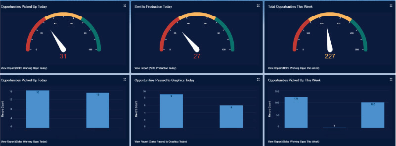
Example of a dashboard pulling multiple reports together to see team effectiveness with goals.

2. Know Your Business Goals
Before you start pulling data, you need to understand the “why” behind it. A generic dashboard serves no one. Your sales manager wants to see pipeline health. Your marketing lead wants to know if that last campaign was worth the budget. Your support team? They’re dying for faster case resolution insights.
This is where you, the admin superhero, step in. Set up a meeting (yes, another meeting) and ask: What metrics keep you awake at night? Align their goals with the metrics you’ll track.
Pro tip: Focus on fewer, more impactful metrics. A dashboard with 50 data points is about as useful as a GPS screaming a hundred directions at once.
3. Building Killer Reports
Crafting a good report is like writing a good story. It needs a beginning, a middle, and an end. The beginning is your filters: What data do you need? The middle is the structure: How do you group and summarize it? And the end? That’s where your summary numbers tell the story at a glance.
Best Practices:
- Use filters like a sculptor uses a chisel—cut out the noise.
- Group data logically. For example, sales by region or cases by type.
- Experiment with formulas for deeper insights, like calculating win rates or average case resolution times.
But remember: less is more. A cluttered report is like a page full of typos—no one’s going to read it.
4. Crafting Dashboards That WOW
A great dashboard doesn’t just report data—it demands action. Imagine you’re a sales leader. You open your dashboard in the morning. What’s the first thing you see? Hopefully, it’s a clear, visual representation of your pipeline health. If not, we have work to do.
Tips for Great Dashboards:
- Prioritize clarity: Use charts and gauges that make sense. A line chart for trends, a bar chart for comparisons, and so on.
- Customize views: Dynamic dashboards let users see their own data. One size rarely fits all.
- Stay focused: Group related metrics together, like sales KPIs in one section and support stats in another.
Think of your dashboard as a movie trailer: short, punchy, and leaving no doubt about the plot.
5. Advanced Moves: Taking It to the Next Level
Once you’ve mastered the basics, it’s time to flex your admin muscles. Here are some next-level strategies:
- Filters for versatility: Let users filter dashboards by timeframe, region, or product line.
- Third-party tools: If Salesforce’s native visualization isn’t cutting it, integrate with tools like Tableau for stunning visuals.
- Optimize performance: Too much data can slow things down. Keep it lean and fast.
Advanced doesn’t mean complicated—it means smarter.
6. The Struggle Is Real: Overcoming Common Challenges
Building reports and dashboards isn’t always smooth sailing. Here are a few roadblocks and how to smash through them:
- Data overload: If your dashboard looks like a data explosion, start trimming. Less is more.
- Dirty data: Use validation rules and regular audits to keep your data clean.
- Unclear metrics: If stakeholders aren’t using the dashboards, go back to the drawing board and ask better questions.
7. A Tale of Success: Hypothetical Use Cases
Picture this:
- Your sales dashboard shows a pipeline with 20% of deals at risk. The sales manager focuses efforts there, closing half of them.
- Your marketing dashboard highlights a campaign with a 10x ROI. You shift budget to double down.
- Your support dashboard identifies a spike in ticket volume every Monday. You adjust staffing to handle the load.
These aren’t just dashboards—they’re decision-making machines.
Conclusion
Creating custom reports and dashboards is part art, part science. When done right, they’re more than just tools—they’re the driving force behind smarter decisions and bigger wins. So start small, keep it simple, and let your dashboards evolve as your team grows.
Call to Action: Ready to transform your reporting game? Log into Salesforce today and start building dashboards that make an impact—or reach out to us for customized reporting.

Get Your Free Assessment
Unlock the full potential of your CRM with MyOnlineAdmin. Whether you’re looking to refine your existing system or need comprehensive guidance on new CRM deployments, we’re here to ensure your organization’s CRM strategy thrives.
